To improve on my draft pages for the final version of Bass Junkie, i intend to retake photos capturing more attitude and personality, truly relating to the theme of hip-hop and to engage and interest readers as they would hopefully be enticed to read on. I want to achieve a look of attitude and mischief using the new models through rethinking the style and relevant fashion and expressions. I will then apply this to a relevant design and structure of a popular, current hip-hop magazine and alter it effectively to gain a professional and consistent design that would appeal to the target audience.
I want the images to be full and capture many sides and angles of the models to ensure that i have lots of choice and variety when it comes to creating the final versions. I also wish to take photos both inside the studio as well as an outside in an urban looking environment to achieve the intended look.
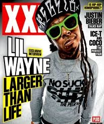
I feel a different approach to what i was initially planning is needed to create a look similar to the current hip-hop magazines which are loved and purchased by many. I will take ideas from XXL, Vibe, The Source and Complex when designing the final versions.
I will take into consideration all the feedback from my draft versions to hopefully get a better outcome from the final pieces.
Friday, 28 February 2014


Feedback from draft pages

- The font of the mast head doesn't work well with the rest of the design.
- The image isn't full sized and the hair of the male is cut off.
- If the image was full sized, then the male's afro could be over the text/mast head.
- The eyes of the male do not look quite right- no attitude is reflected
- The wink should be more exaggerated so it is clear and identifiable
- The barcode is too large.

- There is too much space at the top
- The layout of text is messy and needs to be more precise
- The image is simple and something needs to be added, such as a quote
- The hand on the hip pose is taken on the front cover too
- The spelling of 'Urban' is wrong

- Headline could be improved
- 3 column structure would be more suitable and appealing
- More text is needed
- Text font size is too large (18) needs to be smaller
- The pull quote needs to be taken from the interview.
Wednesday, 26 February 2014
Draft versions of pages
COVER:

CONTENTS:

DOUBLE PAGE SPREAD:

Using test shot images of models which i felt met the criteria for the hip-hop genre (inspired by Iggy Azalea and Abel Tesfaye from The Weekend) i put together relevant text and images to create draft version of how i want my magazine to look.
This gave me ideas and ways to improve for the final version of the pages as i was able to gain feedback and ideas for improvements on these mock ups. I realised during creating the drafts that there are many elements to Photoshop which can help achieve a professional magazine through imagery, text and style.
Target for the week
This week I am going to research other hip-hop magazine covers, contents and double page spreads to get an idea of what I am aiming for when designing Bass Junkie pages. I will look at successful magazines to find out what works and what appeals to those with an interest in this genre of music; taking into account colours, fonts, sizes, positioning's and styles etc.
Sunday, 9 February 2014
Flat plan
I decided to devise a flat plan on A3 paper before designing my magazine on Photoshop; i felt this would give me a better/clearer idea of what i was planning to achieve with each page. This was a rough copy and i simply included the basics on each page, giving me something to base ideas on and make alterations where necessary.
COVER FLAT PLAN

CONTENTS FLAT PLAN

DOUBLE PAGE SPREAD FLAT PLAN

Monday, 3 February 2014
Feedback Survey
Create your free online surveys with SurveyMonkey , the world's leading questionnaire tool.
Subscribe to:
Comments (Atom)